How to Customize the Application's Theme
Required Permissions
This section requires the Application Designer permission from your Workspace's administrator.
Check What are the Design Tasks? to learn more about permissions to work with Design Mode and other tools.
Learn how to customize the App Theme. The App Theme includes the colors of the top bar, logo, toolbar, and editable cells' highlighting.
Designers can customize the following elements in an application's interface:
- The top bar's color.
- The toolbar's color.
- Adding an optional logo to the top bar's left corner, next to the user's name.
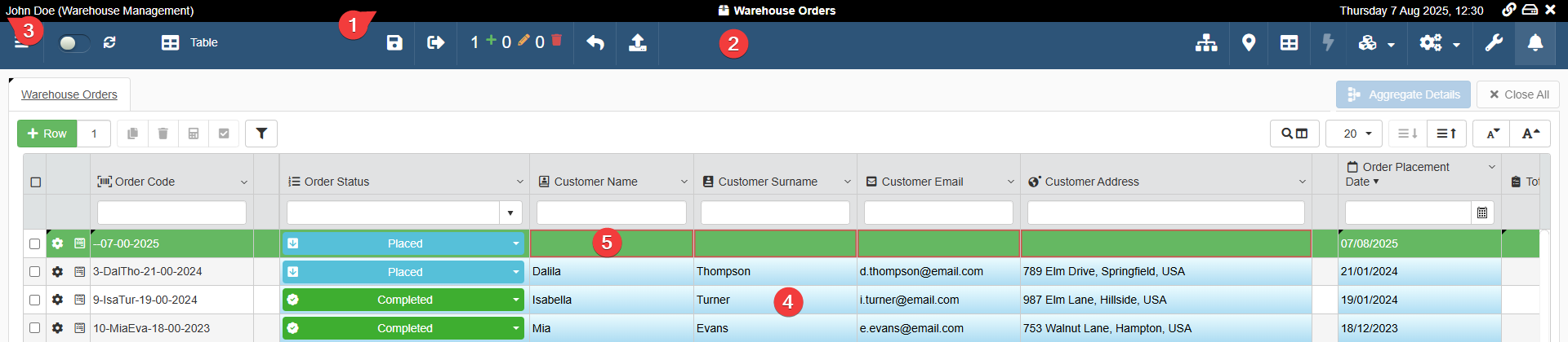
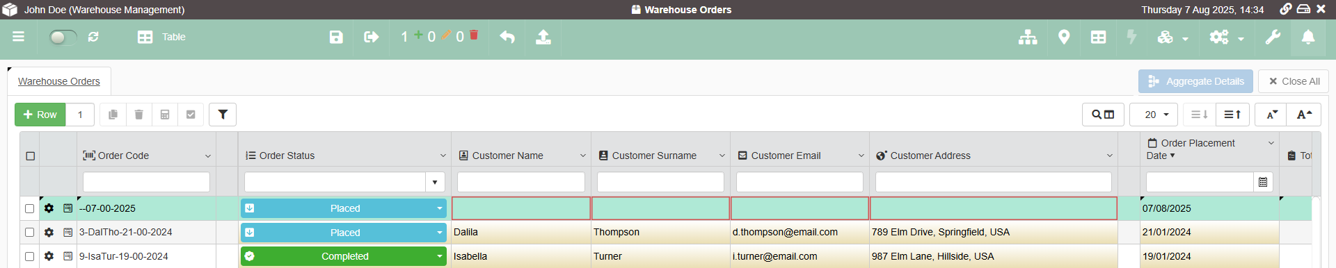
- The color gradient highlighting the editable cells on the table.
- The color highlighting new rows not saved.
Note
If the Designer has configured a specific color for a column's cells (in Design Mode > Layout > Cell Colors bg), the Cell Colors bg choice overrides the application's choice for the color gradient highlighting the editable cells (4).
See Change Table Headers or Cells Colors and Format for more information about customizing the column cells' colors.
Follow the steps below to customize the App Theme.
-
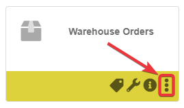
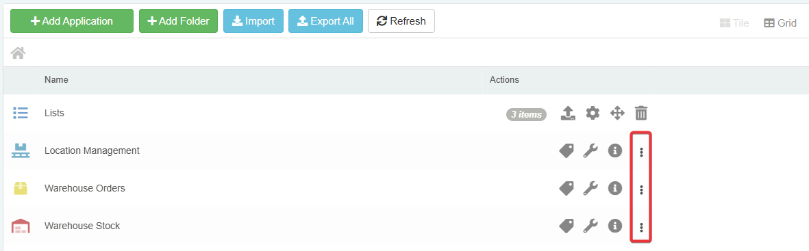
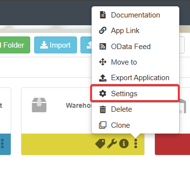
In the Home, click the icon on the application in either Tile or Grid view.
-
Click on the Settings option from the drop-down list menu. The action leads to the Application Settings.
-
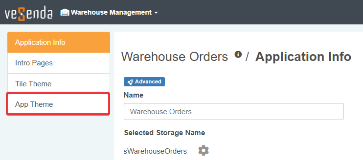
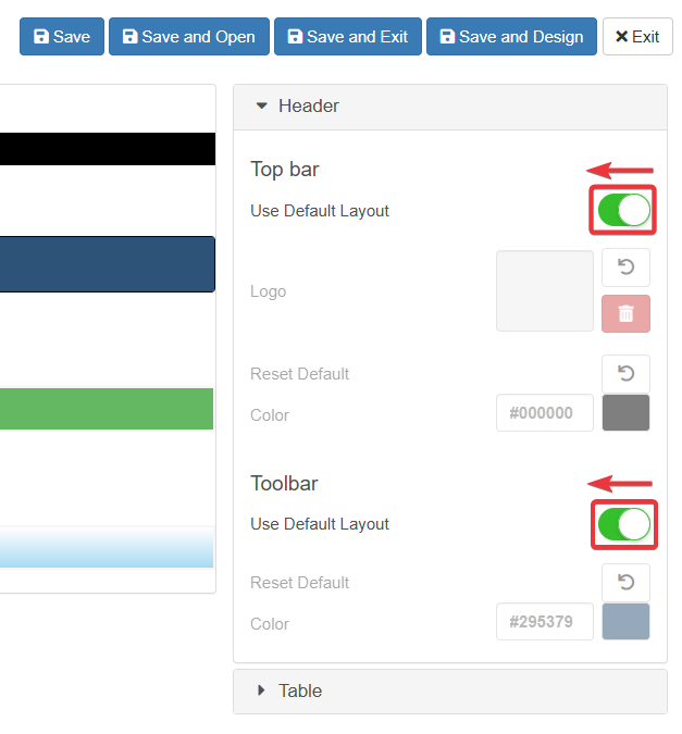
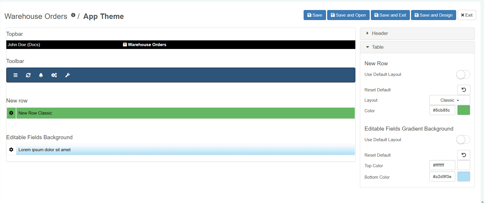
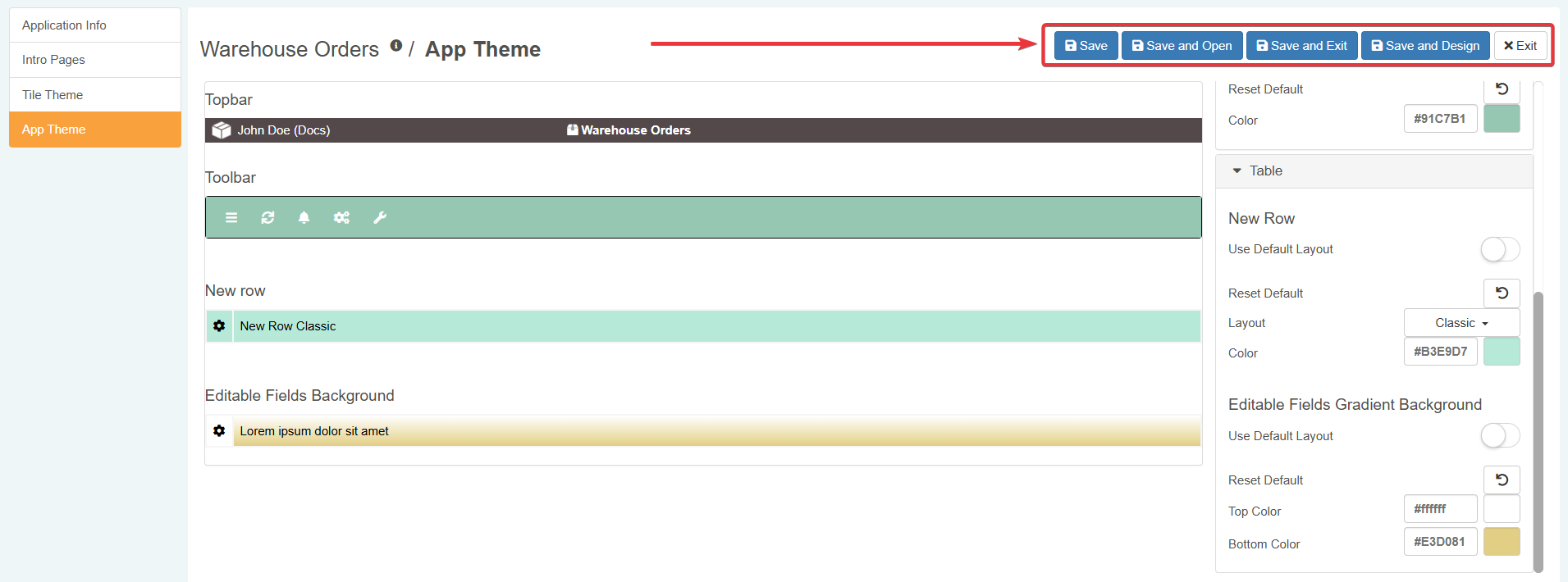
In the Application Settings, click on the App Theme tab in the left sidebar. The action leads to the panel where you can customize the application's colors.
-
In the App Theme panel, you can customize the application's theme.
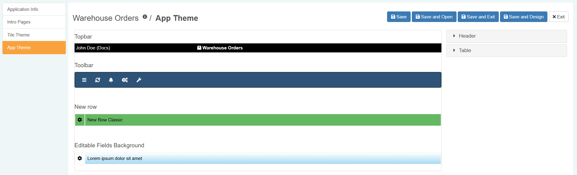
Click on a section to expand its options.
Turn off the Use Default Layout switch to override the eLegere default configuration for the desired setting.
Tip
If you turn On again the Use Default Layout toggle switch, you will use the default configuration while keeping the settings already customized saved.
Click on the Reset Default button () to reset a setting you have customized to the default configuration.
-
Expand the Header section to customize the toolbar and icons.
-
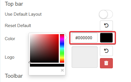
Topbar
-
Click on Color to choose a color through the picker or type the color's Hex Code
-
Click on the square to upload a
*.jpegor*.svgor*.pngfile as logo. The logo will appear in the left corner of the top bar.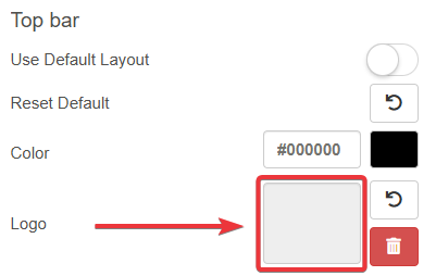
-
-
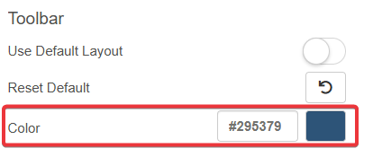
Toolbar
-
Click on Color to choose a color through the picker or type the color's Hex Code
-
-
-
Expand the Table section to customize the rows' appearance.
-
New Row
-
Choose how the application should highlight a row created but not saved yet. (The default option is Classic.)
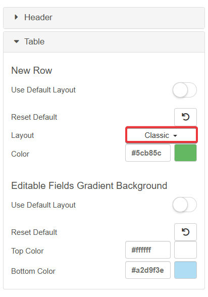
- Classic: The application highlights the whole row.
- Solid: Highlights only the Settings () button's cell on the row.
- Minimalist: Highlights the row with a small bar on the side.
-
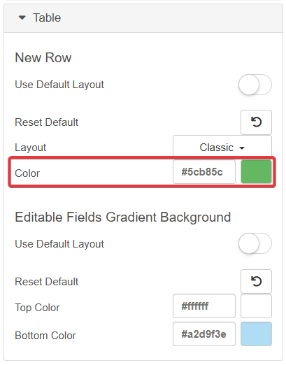
Click on Color to choose a color through the picker or type the color's Hex Code
-
-
Editable Fields Gradient Background
-
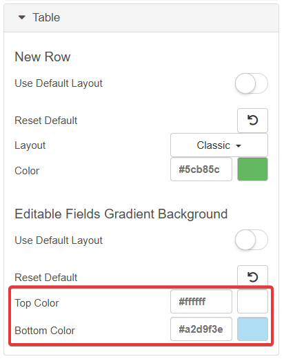
Click on Top Color (upper row's half) or Bottom Color (lower row's half) to choose the gradient's colors. Click on the picker or type the colors' Hex Codes.
-
-
-
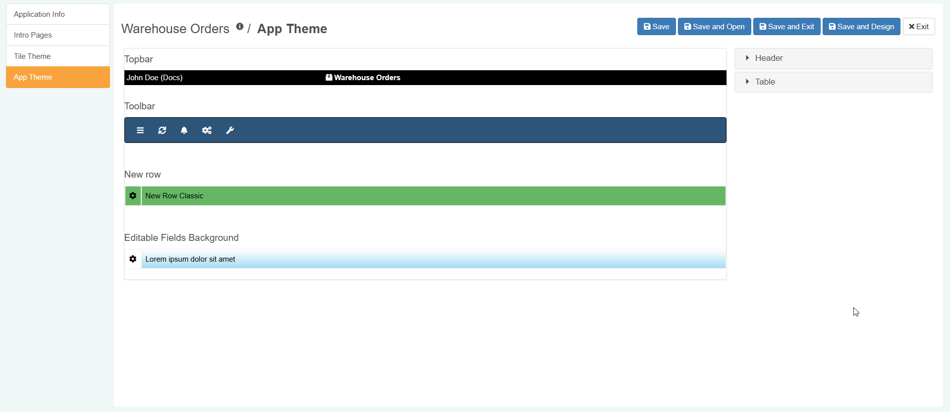
Once done, click on Save, Save and Open, Save and Exit or Save and Design to save the changes. (If you have changed your mind and you don't want to save the changes, click on the Exit button instead.)
The application will launch with the new colors' customizations and the chosen logo.
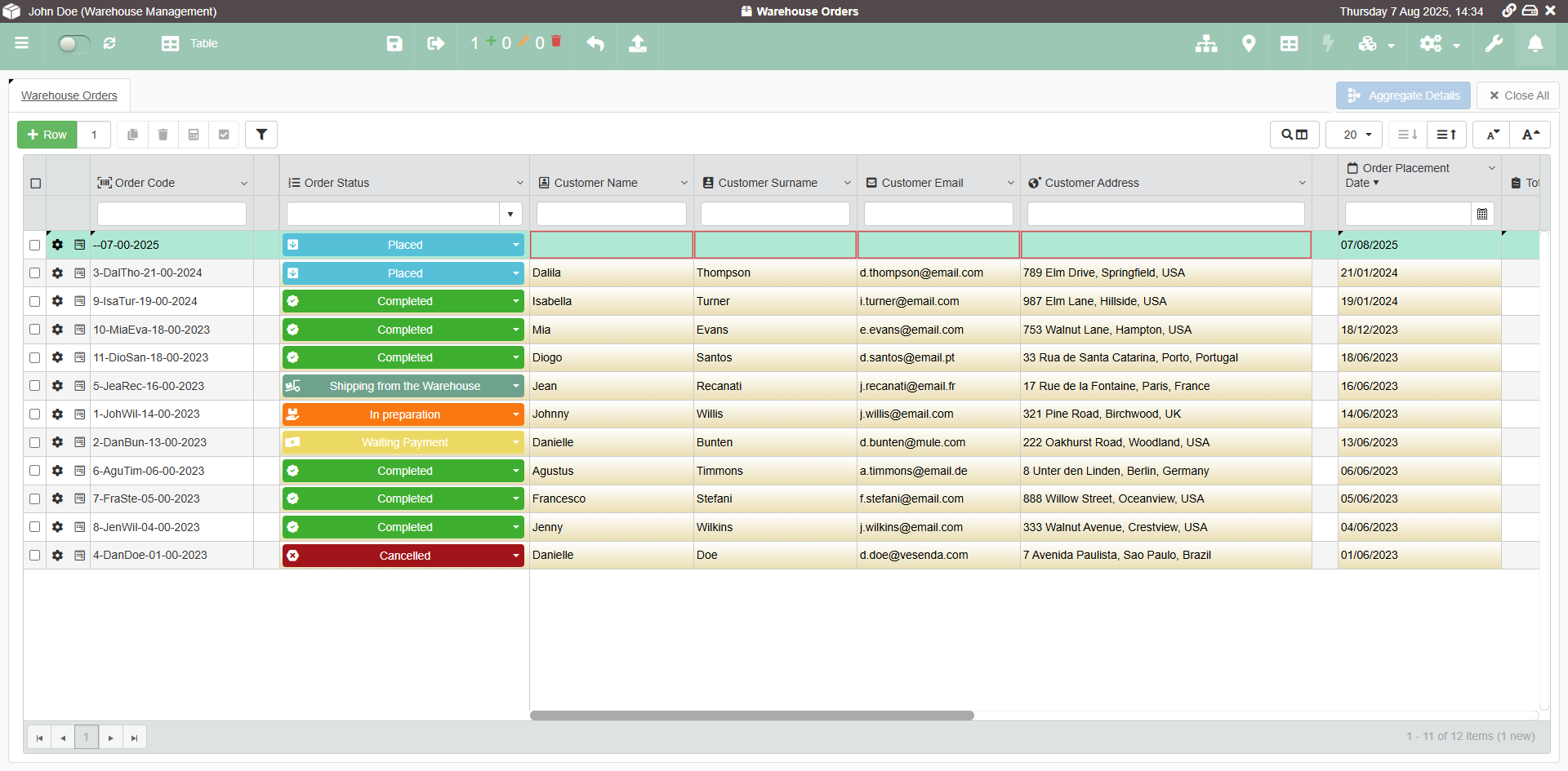
Success
You have customized the colors of the top bar, toolbar, the editable cells' highlighting, added a logo, and how the application highlights new rows not saved.