Table
Info
Table is the main module where to setup all the App's Configurations and see data in grid mode
Design Mode
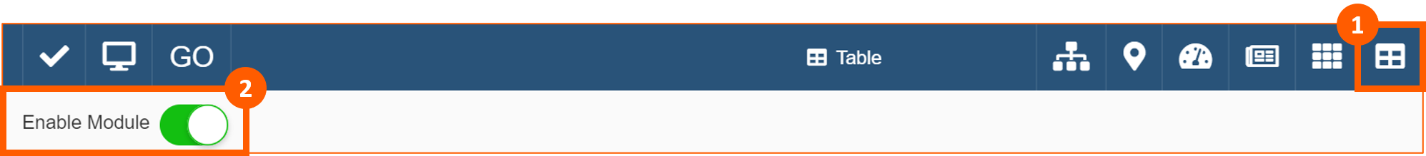
This module is automatically enable, but if it wasn't, to enable it from Design Mode, click on the Table icon in the Toolbar (1) and Enable Module (2):
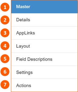
On the left side, you have the possibility to configure following sections:
User Interface
To use Table click on the icon (1) in the Toolbar in View Mode:

Pending Changes
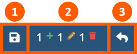
In the Toolbar you can:
- Save changes
- See Pending Changes:
Rows you're creating
Cells your're editing
Rows your're deleting - Undo changes
Clicking on Pending Changes you the possibility, using Created (1), Edited (2) and Deleted (3), to filter rows that you're creating and/or editing and/or deleting (selection will be highlighted in orange):

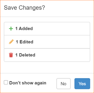
Confirm Changes
If Confirm Changes is enabled, everytime you will save changes, it will be open a pop-up window with a summary of changes that you are saving. You can also check Don't show again option to avoid opening of this pop-up everytime:
Export
If Export is enable, in the Toolbar it's visible the icon :

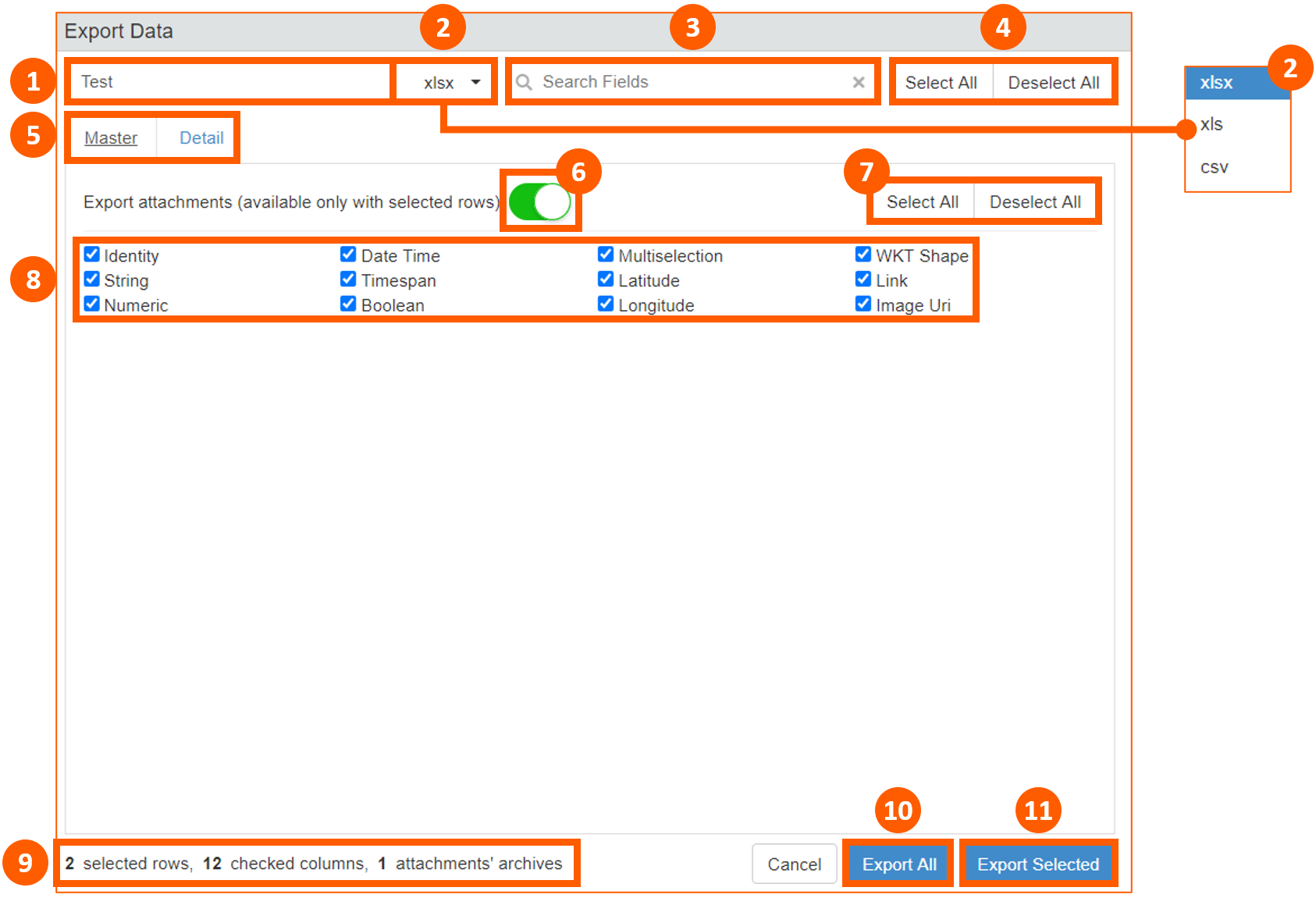
Clicking on the icon, it will be opened a pop-up where you can:
- Put a Filename
- Choose the file format (xlsx, xls, csv)
- Search Fields to check
- Select All or Deselect All tables
- Choose table available
- Export attachments (available only with selected rows)
- Select All or Deselect All columns of the table
- Choose columns of the table
- See summary about selected rows, checked columns and attachment's activities
- Export All
- Export Selected (available only if you selected before rows in the table)
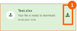
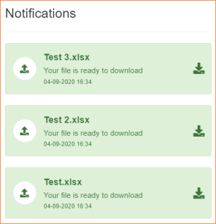
After running export command a pop-up message advises that file is ready to download. Clicking on icon (1) it's possible to dowload the file:
In the Toolbar on icon there will be a counter to advise about unread notifications and clicking on it you will see the entire history:

Note
There's a limit of 20.000 records that User can export
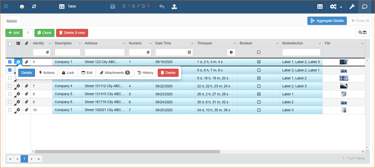
Add, Clone & Delete rows
If Enable Add Row, Enable Clone Row and Enable Delete Row are enabled, it's possible to Add (1), Clone (2) or Delete (3) rows in the grid:
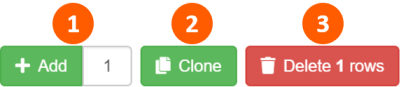
You can add simultaneously maximum 20 rows, changing the number in the box (1) near Add button:

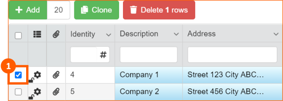
You can Clone one row at a time or Delete more than one row. To select row you have to check it (1):
Search columns
You can search for a column using the column search tool available to the Table module. This feature is useful when you have a table with a lot of columns:

Clicking on the icon will activate the search box:

As soon as you start typing, system will move to the first column that matches your search:
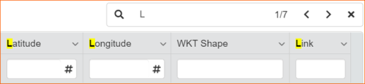
You can use the arrows to move between matches.
It's possible to use also keyboard Shortcut:
| Shortcut | Action |
|---|---|
| Enter or F3 | Go to the next result (right arrow) |
| Shift + F3 | Go to the previous result (left arrow) |
| Esc | Close the Search Box |
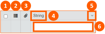
Header
In the Header of the Table you can:
- Select all the rows
- Auto resize the size of the column
- See if the Attachment feature is enabled
- See the name of the column
- Open Drop Down Menu with additional option
- Filter Column data
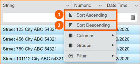
Drop Down Menu
If Is Sortable setting is enabled, in the drow down menu with additional option, you will have Sort Ascending (1) and Sort Descending (2) option:
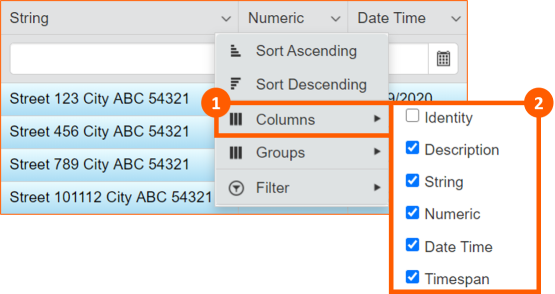
With Columns option (1) you can show / hide columns checking them (2):
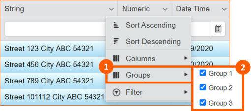
If there are configured groups in the Properties module, with Groups option (1) you can choose which group of fields you want to show / hide checking them (2):
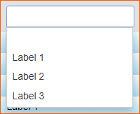
For Lookup and Multiselection field by default or if Multiselection Filter setting is enabled, it's possible to use also Filter (1) option and choose which filter you want to apply or not (2):
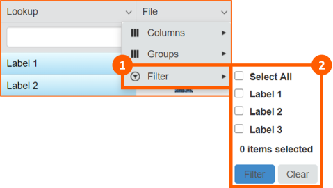
Filter Column
If Is Searchable setting is enabled, there will be tool to type and a widget to select data:
| Field Type | Tool | Widget |
|---|---|---|
| Boolean | 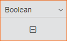 |
for true values for false values for null values |
| Date Time | 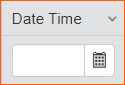 |
 |
| File | ||
| Lookup & Multiselection | 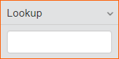 |
 |
| Numeric, Identity, Latitude, Longitude | 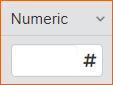 |
|
| String, WKT Shape, Link, Image Uri | 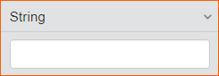 |
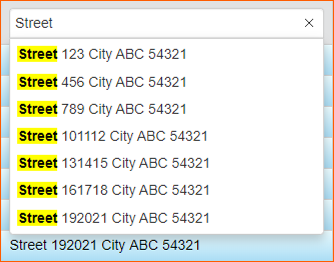 |
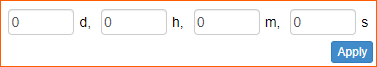
| Timespan | 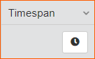 |
 |
Row Option
For each row, clicking on the icon it's possible to access to the Row Option (according to the configurations enabled):

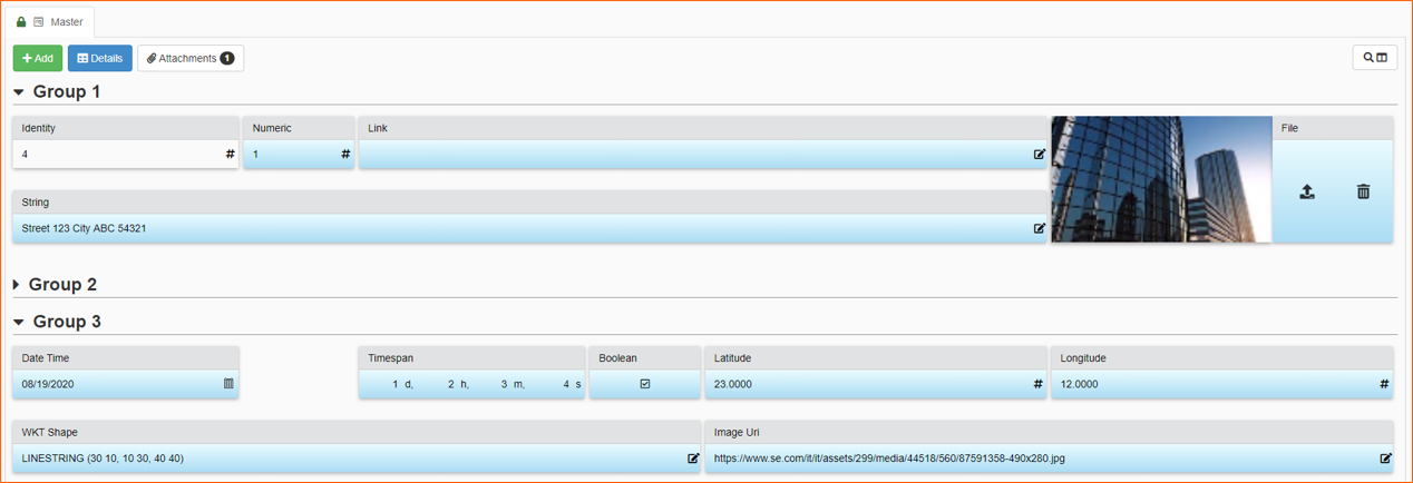
Details
If Details are enabled, it's possible to open them clicking on Details button:

Shortcut
To open Details you can also double click the icon
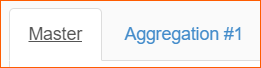
If you selected more than one row, you can also use Aggregate Details button:

It will be created a Detail tab contained data aggregated:
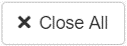
To close all Detail tabs click on Close All button:
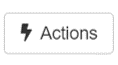
Actions
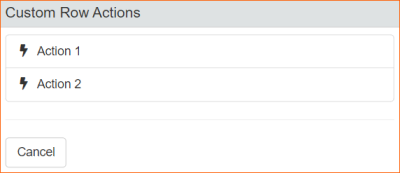
If Custom Actions module is enabled and there are active Row Custom Actions, it's possible to run them clicking on Actions button:
It will be opened a pop-up window where you can choose the available actions:
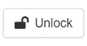
Lock & Unlock
If Rows Check Out is enabled, you have the possibility to Lock & Unlock rows clicking on the buttons:

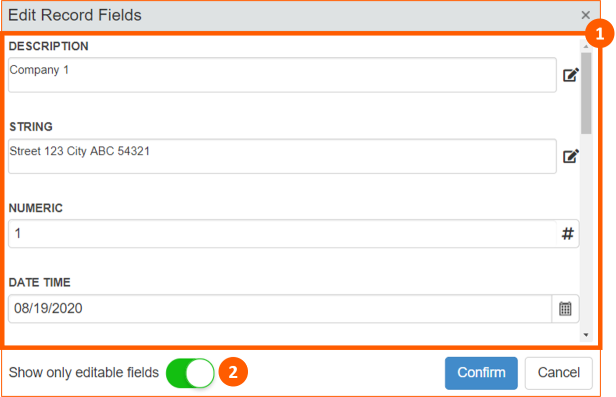
Edit
With Edit option you have the possibility to edit data using a vertical form:

It will be opened a pop-up window where edit data (1) and also Show only editable fields (2):
If Input Form module is enabled, clicking on Edit button, it will be opened the Input Form:

Attachments
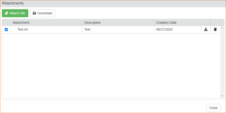
If Attachments are enabled, it's possible to open them clicking on Attachments button:
It will be opened a pop-up window where you can manage the row's attachments:
History
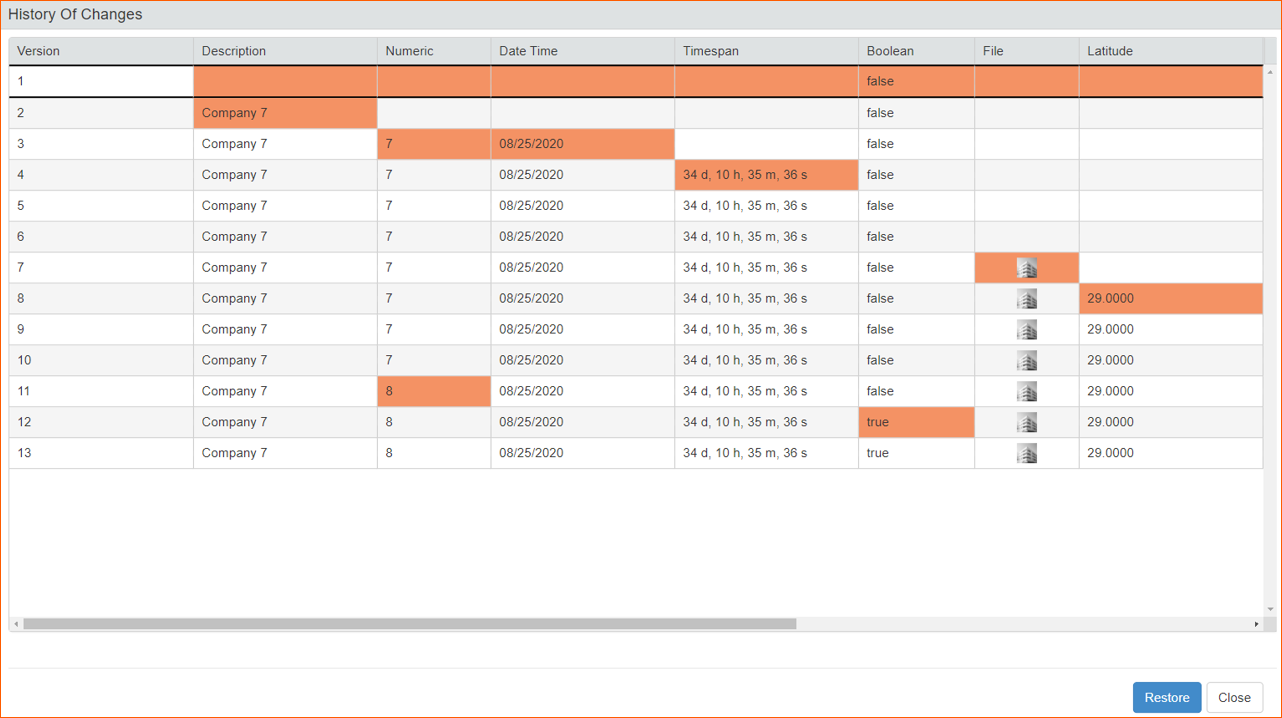
If History is enabled, it's possible to open it clicking on History button:
It will be opened a pop-up window where you can see cell value changes (colored in orange) and, if enabled, restore them:
Delete
If Delete setting is enabled, you can remove row clicking on Delete button:
Footer
Pages
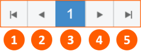
In the footer of the table you can use following tools:
- Go to the first page
- Go to the previous page
- Current page
- Go to the next page
- Go to the last page
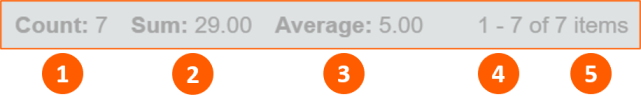
Counters
In the footer you have also counters about selected items with:
- Count
- Sum (only for Numeric fields)
- Average (only for Numeric fields)
- Number of items in the current page
- Total items number