Customize the Detail Navigation’s Tab Appearance
Required Permissions
This section requires the Application Designer permission from your Domain's administrator.
Check What are the Design Tasks? to learn more about permissions to work with Design Mode and other tools.
Learn how to customize the appearance of the Detail table's tab in the application.
Follow the steps below to customize the Detail's tab.
-
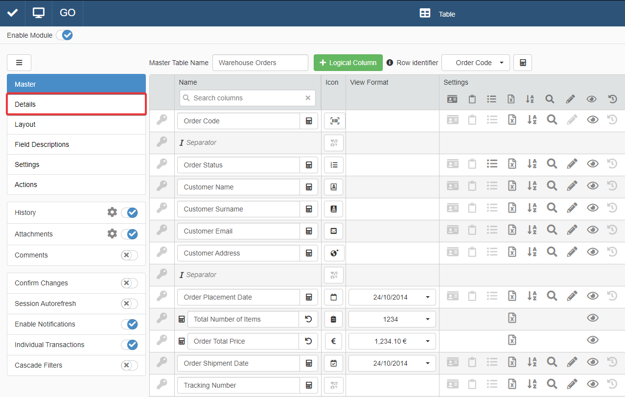
In Design Mode in the main panel Table, click on Details in the left sidebar.
-
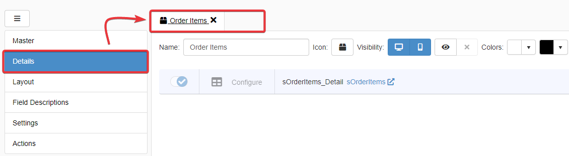
In the Details sub-panel, click on the tab of the Detail you want to change (if you have multiple Details).
-
Click on Icon button to choose an icon to identify the selected Detail's tab.
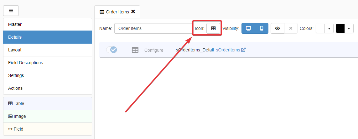
You can choose or search a particular icon.
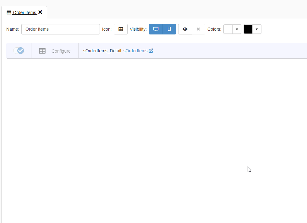
The choice is confirmed automatically. The selected icon will appear on the button.
-
Click on the icon to disable or enable the Detail's table view on Desktop browsers. (By default, the Desktop view is enabled when you create a Detail.)

-
Click on the icon to disable or enable the Detail's table view on Mobile. (By default, the Mobile view is enabled when you create a Detail.)

-
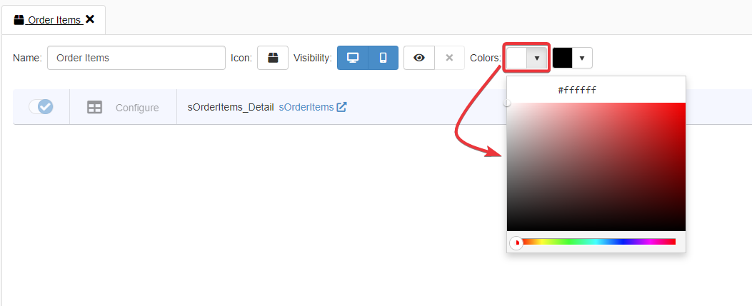
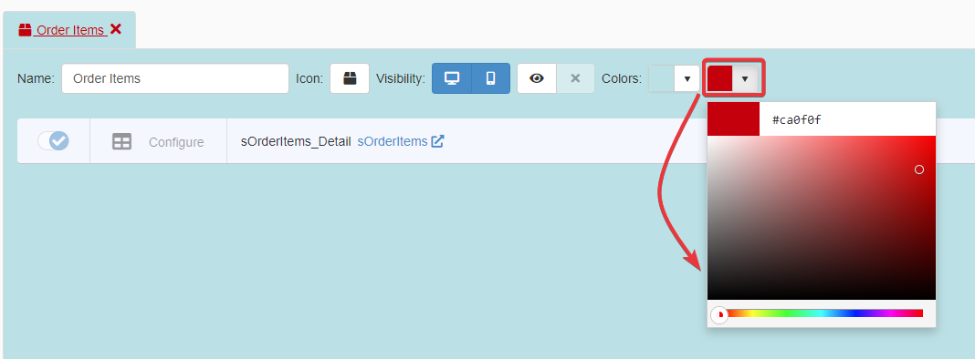
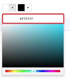
Next to Colors, click on the left palette to choose the Detail tab's background color.
-
Next to Colors, click on the right palette to choose the Detail tab's background text.
-
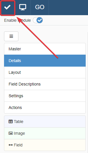
Click on the Save button in the upper-left corner of the Design Mode to save the changes.
Success
You have customize the appearance of a Detail's tab in the application.